Brand Identity Refresh With Upmost Care
Brand Identity Refresh With Upmost Care
Whiddon
Whiddon
Whiddon Group has been providing award-winning aged care solutions to Australians for over 70 years. A not-for-profit organisation employing close to 2,000 staff and caring for over 2,000 people. Working closely with their team, we developed a refreshed brand identity that delivers on their customer promise – ‘Enriching lives by keeping people connected to, and participating in, the things that matter to them’.
Whiddon Group has been providing award-winning aged care solutions to Australians for over 70 years. A not-for-profit organisation employing close to 2,000 staff and caring for over 2,000 people. Working closely with their team, THERE developed a refreshed brand identity that delivers on their customer promise – ‘Enriching lives by keeping people connected to, and participating in, the things that matter to them’.
Brand Strategy / Brand Architecture / Naming / Brand Identity / Digital Design / Print / Brand Book / Brand Guidelines / Signage / Vehicale Livery / Uniforms
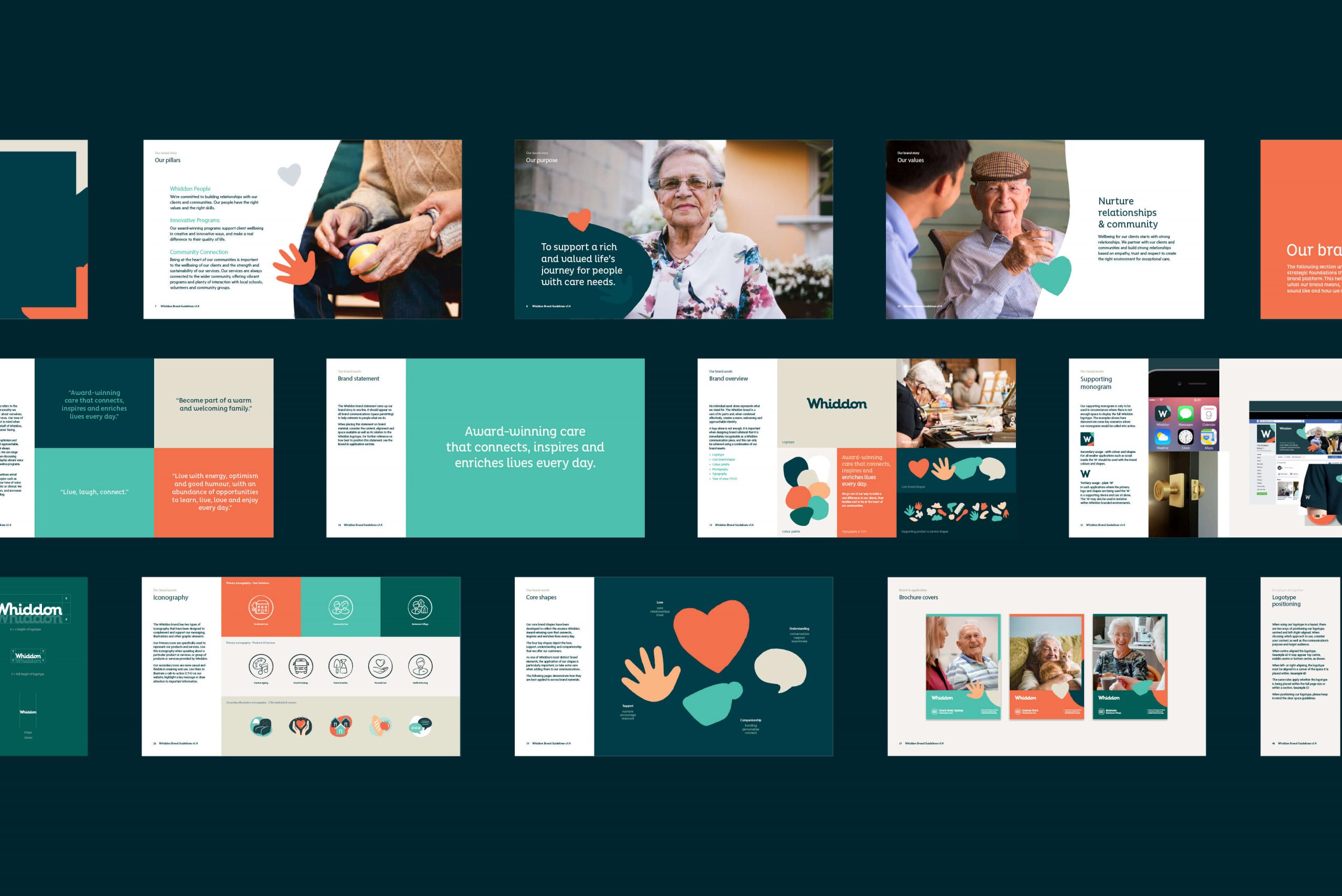
The Core Essence Of The Refreshed Identity
The Core Essence Of The Refreshed Identity
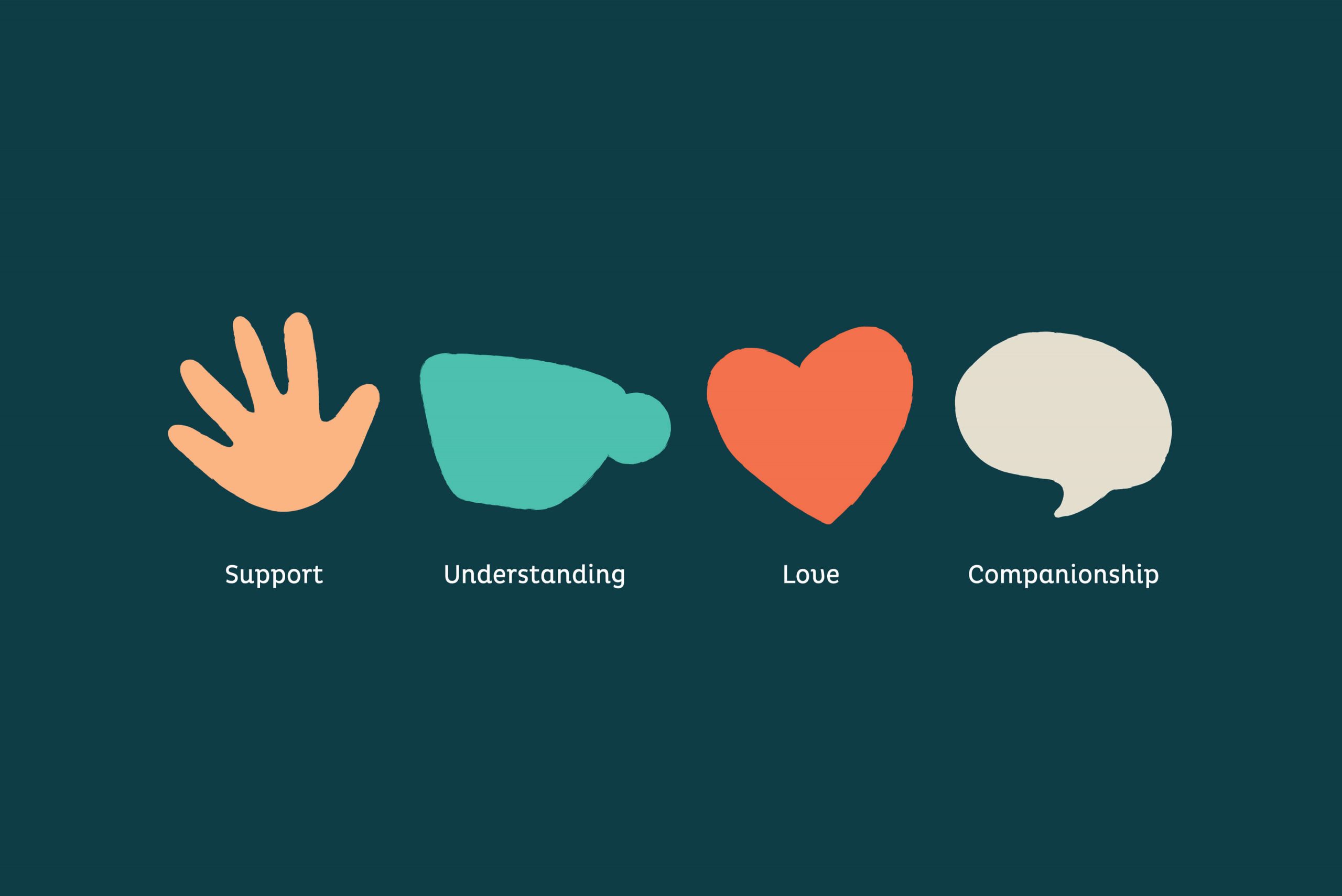
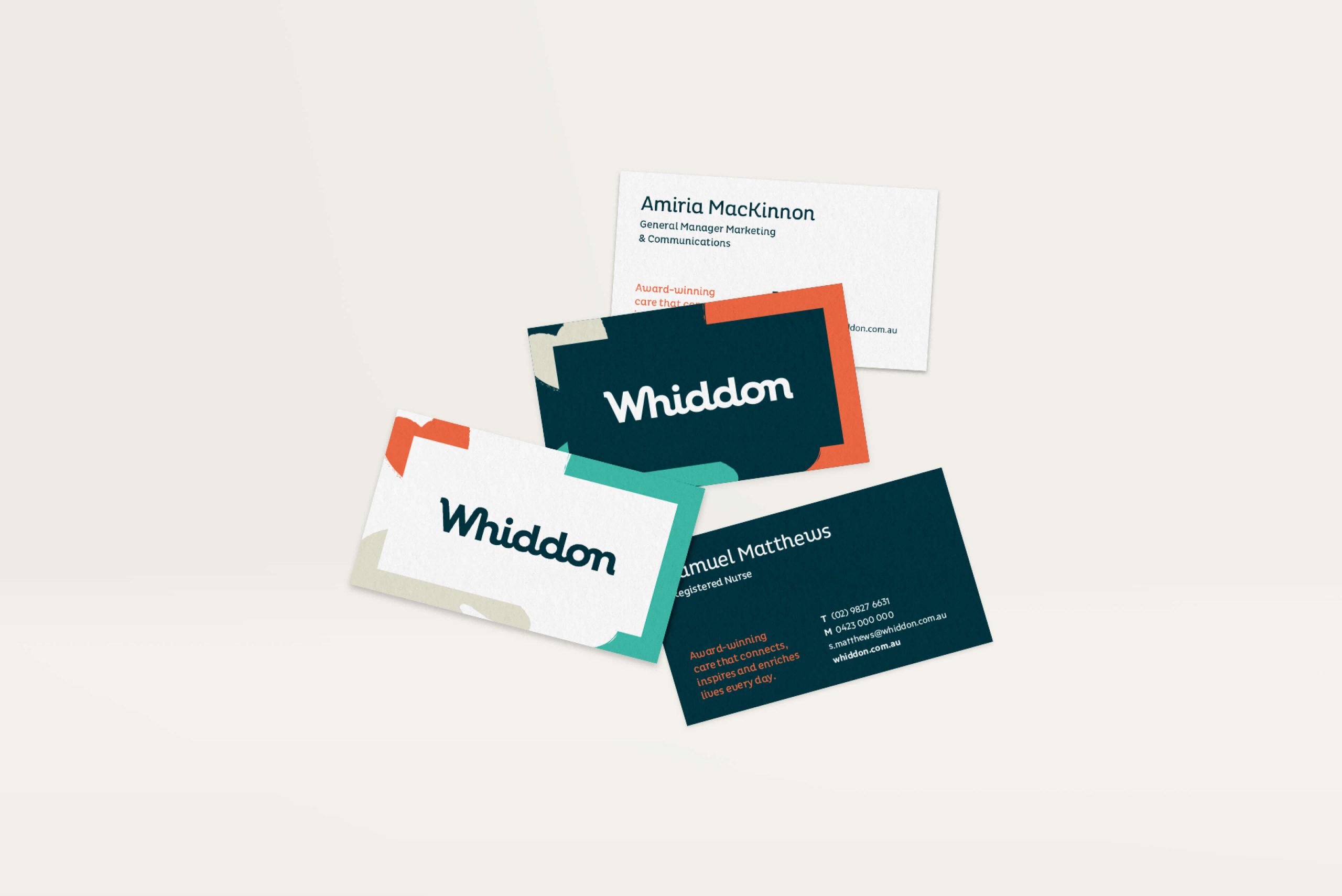
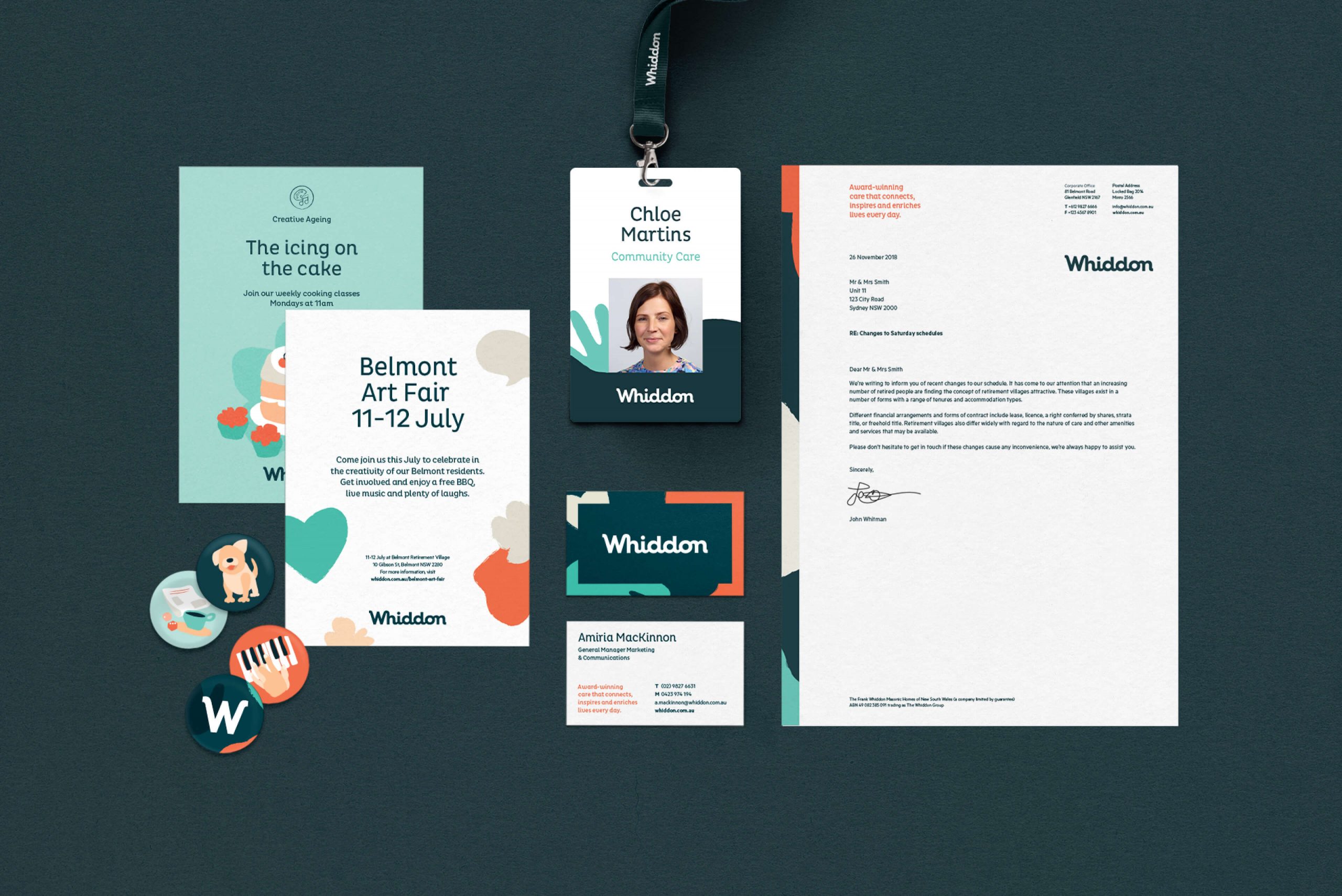
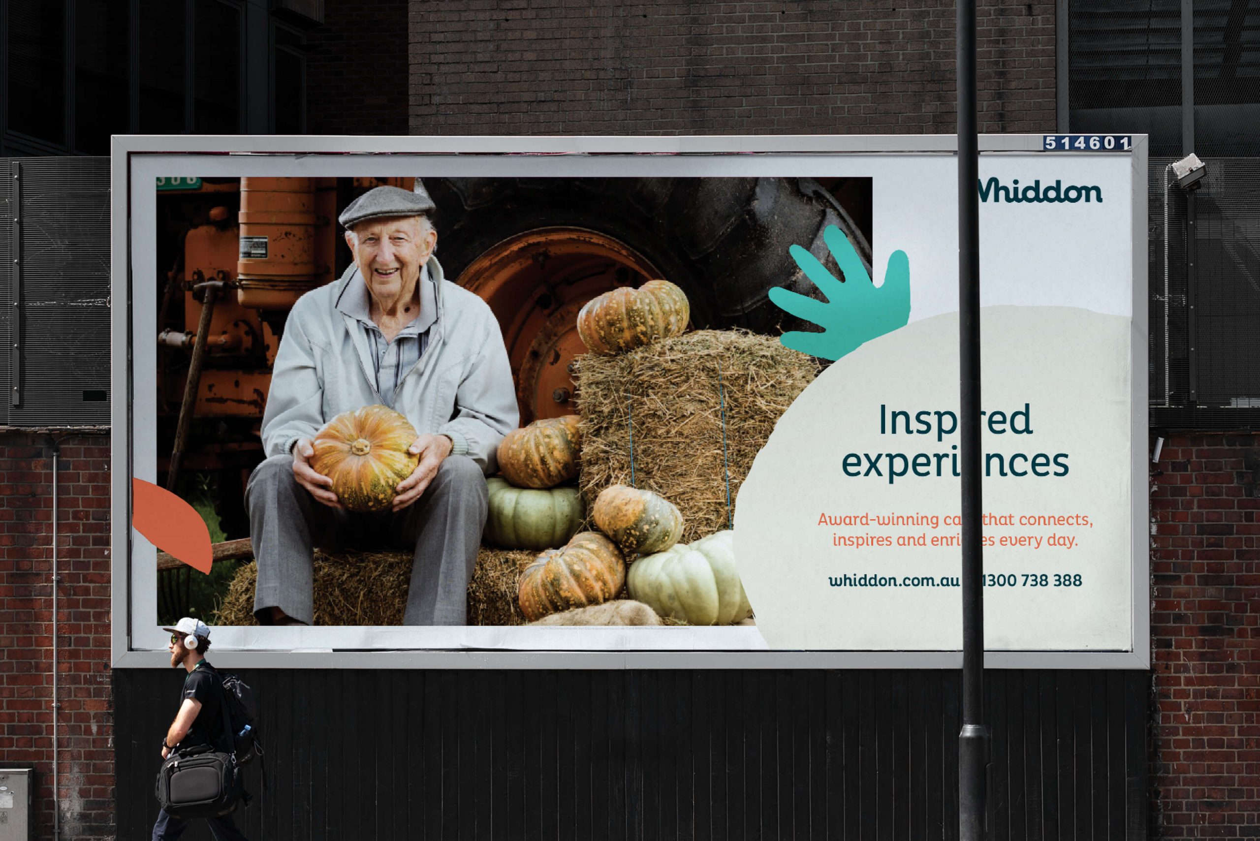
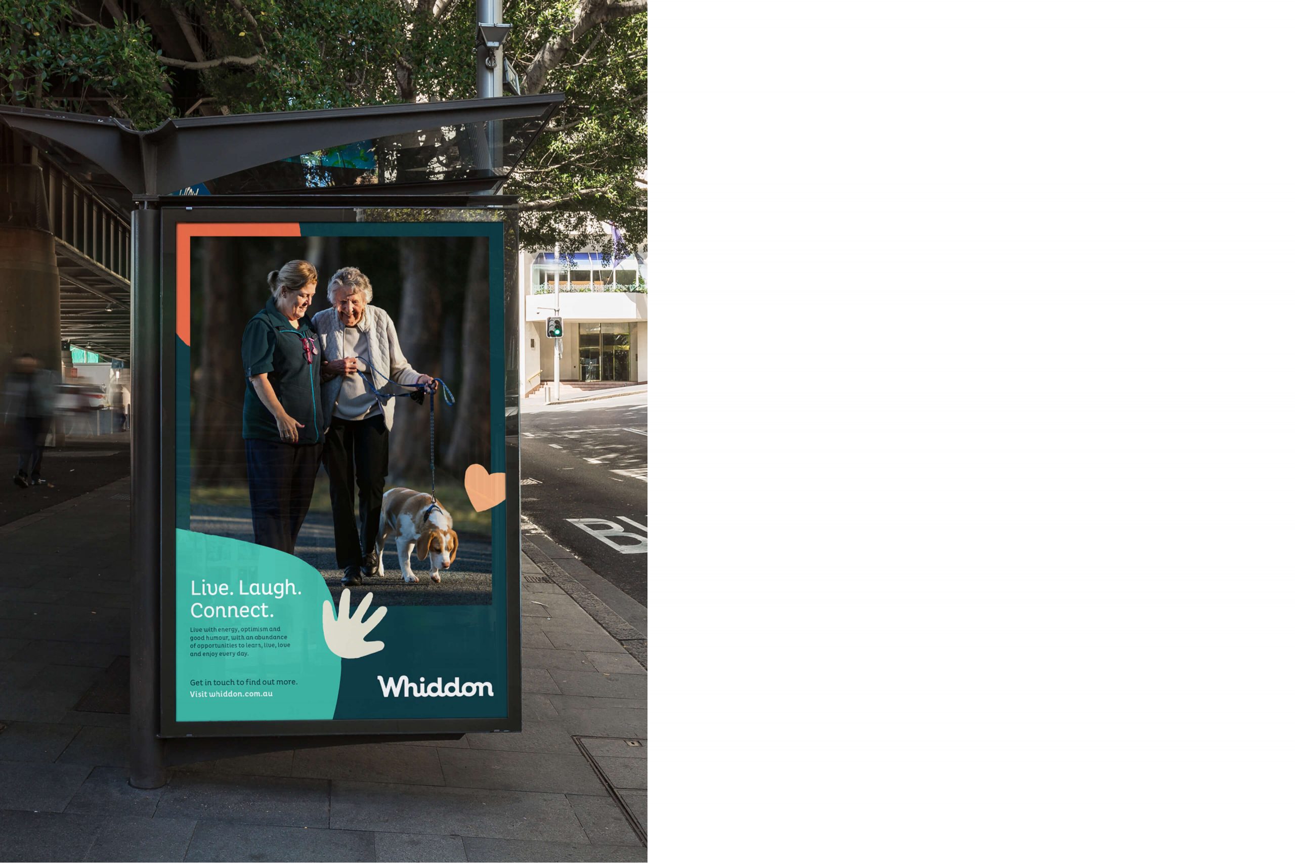
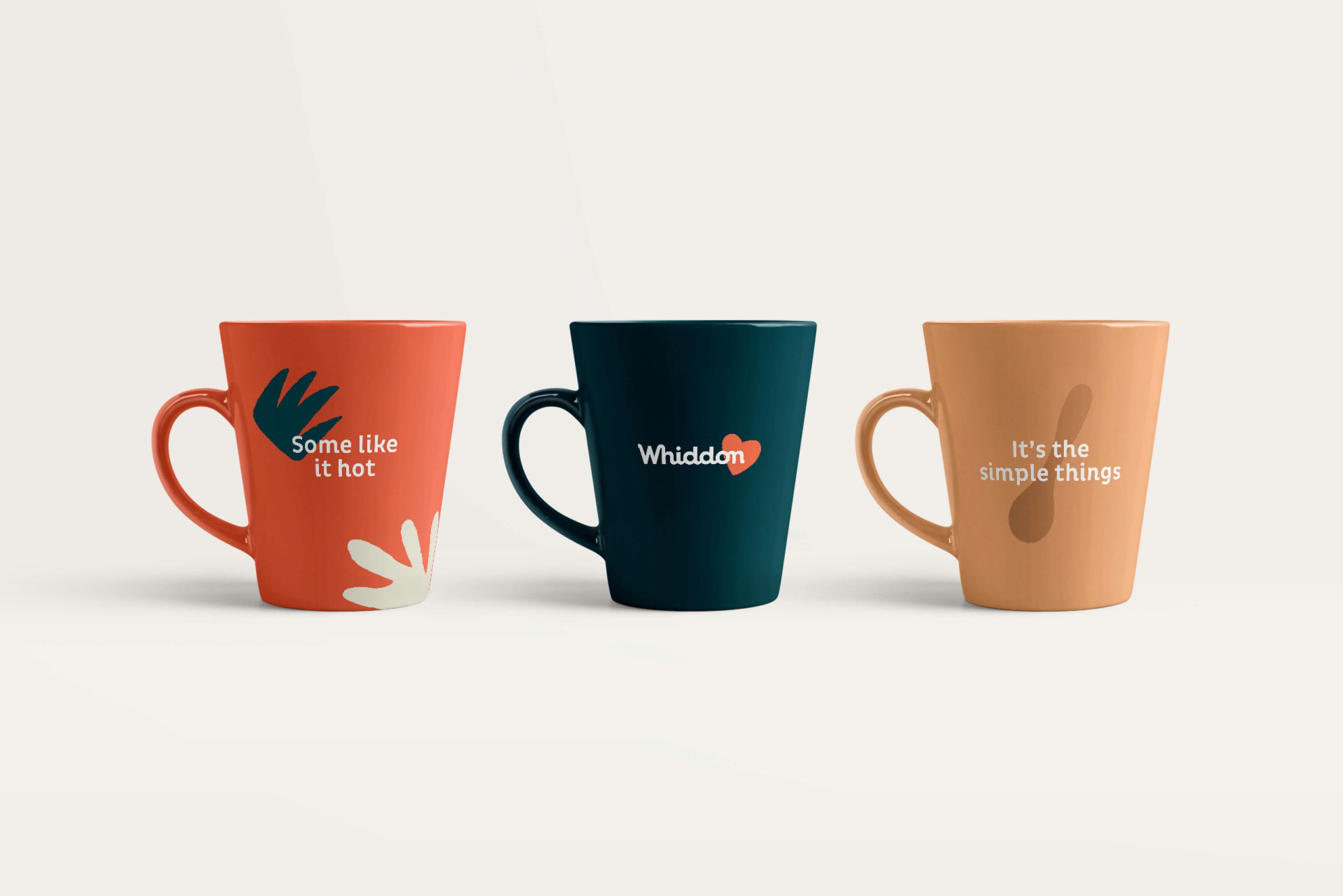
As a business, Whiddon is all about connections and human relationships. Our bespoke logotype sought to reflect this, joining characters to create one seamlessly connected mark that is both friendly and distinct. This concept was further reinforced by a set of charming illustrations and shapes appearing throughout the brand, designed to reflect both the organisation’s values and services, and add a sense of warmth to their communications.
As a business, Whiddon is all about connections and human relationships. Our bespoke logotype sought to reflect this, joining characters to create one seamlessly connected mark that is both friendly and distinct. This concept was further reinforced by a set of charming illustrations and shapes appearing throughout the brand, designed to reflect both the organisation’s values and services, and add a sense of warmth to their communications.
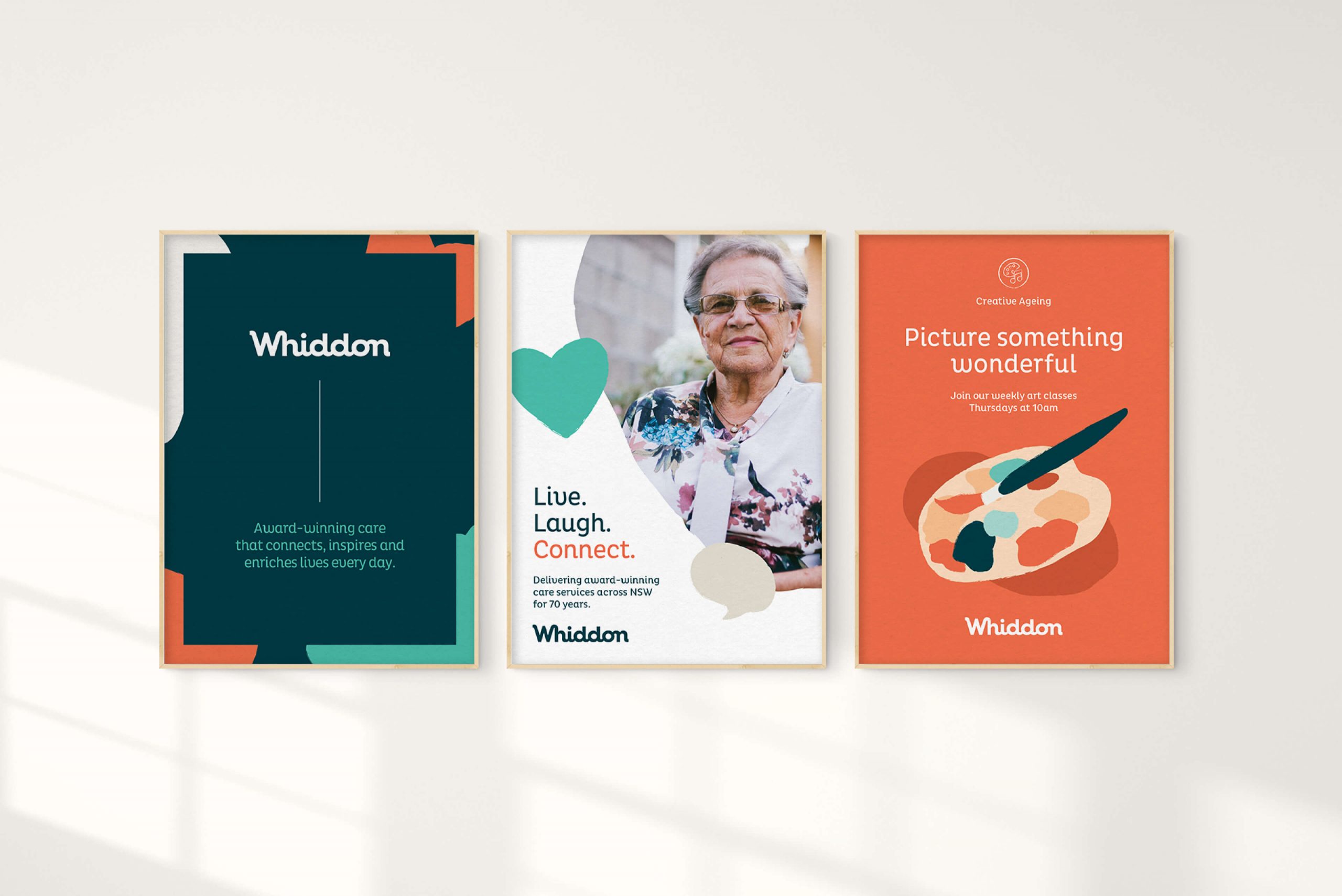
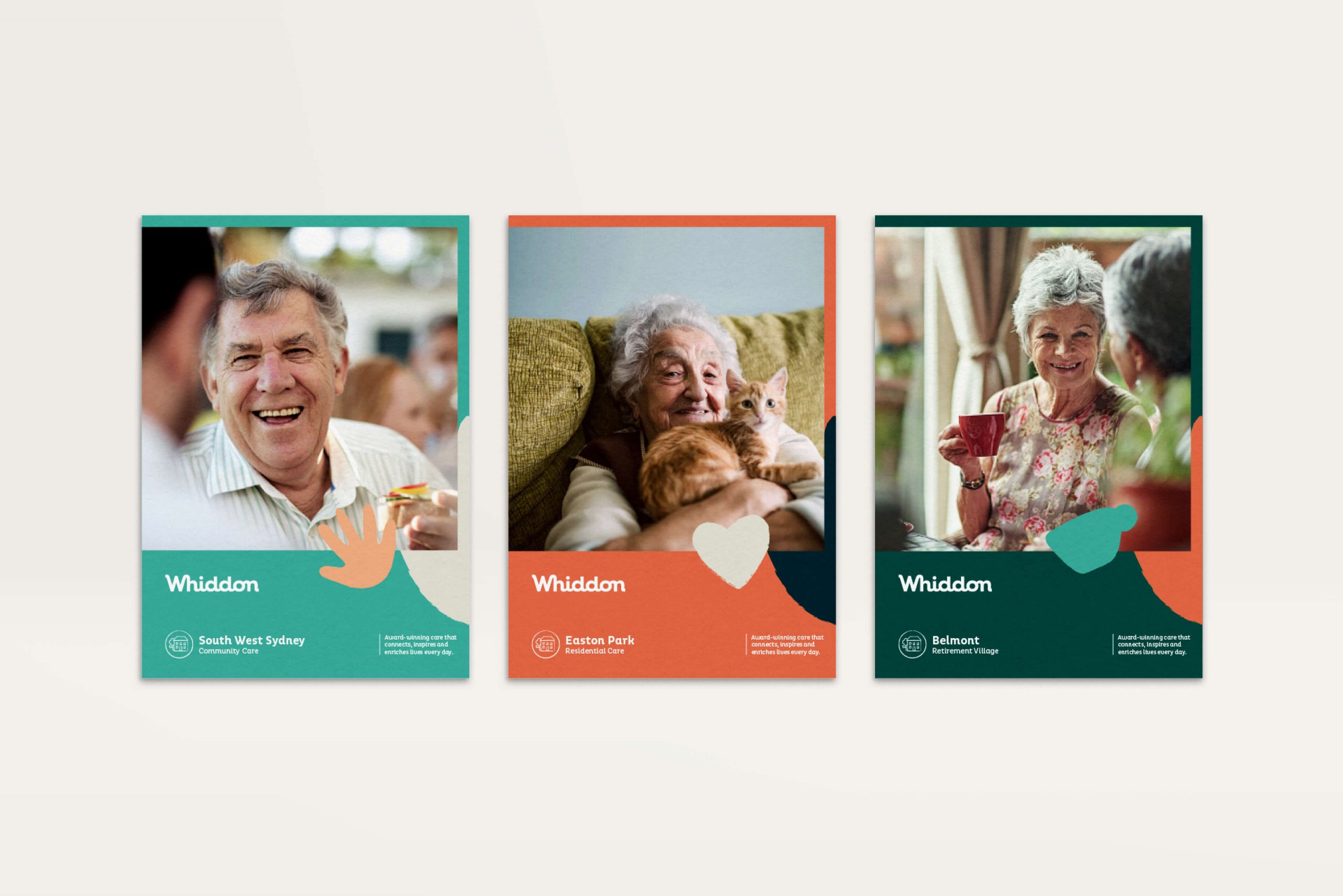
Re-inforcing A Key Point of Difference
Reinforcing A Key Point of Difference
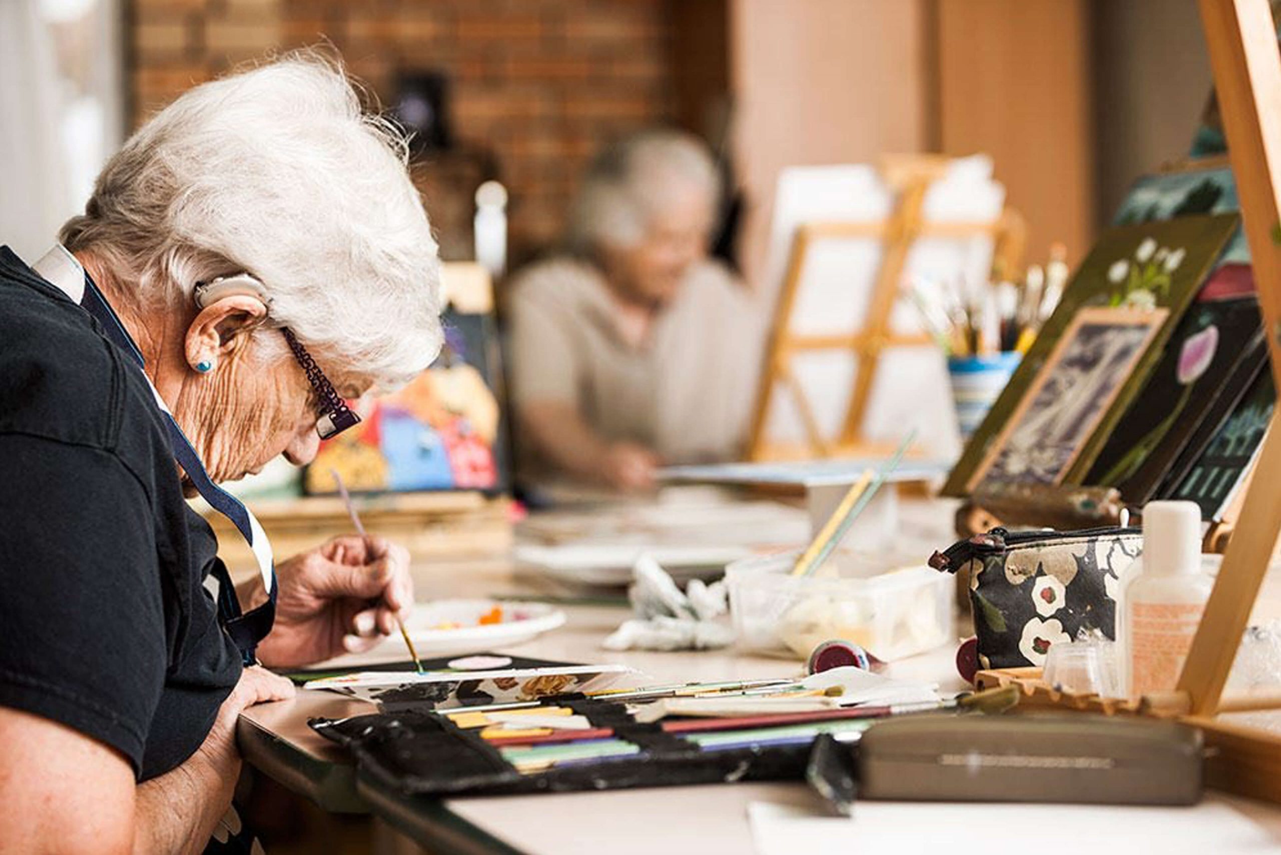
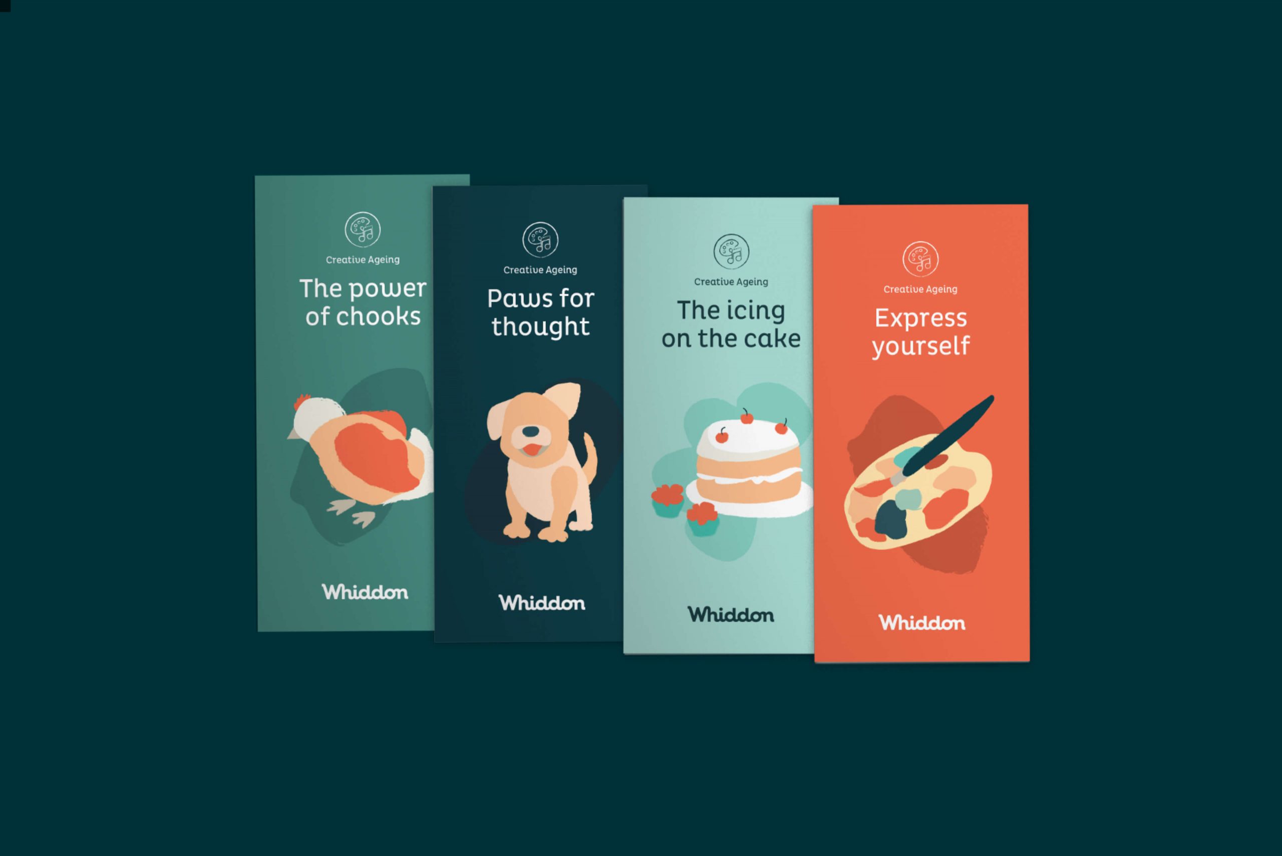
Approaching aged care from a holistic view, Whiddon’s Creative Ageing programs are part of what makes them so unique. From gardening and art to singing, cooking and even raising chooks, these creative programs helped inform the brand’s illustrative visual language. A set of hand-drawn illustrations and shapes were created to reflect both the organisation’s values and services, and add a sense of warmth to their communications.
Approaching aged care from a holistic view, Whiddon’s Creative Ageing programs are part of what makes them so unique. From gardening and art to singing, cooking and even raising chooks, these creative programs helped inform the brand’s illustrative visual language. A set of hand-drawn illustrations and shapes were created to reflect both the organisation’s values and services, and add a sense of warmth to their communications.

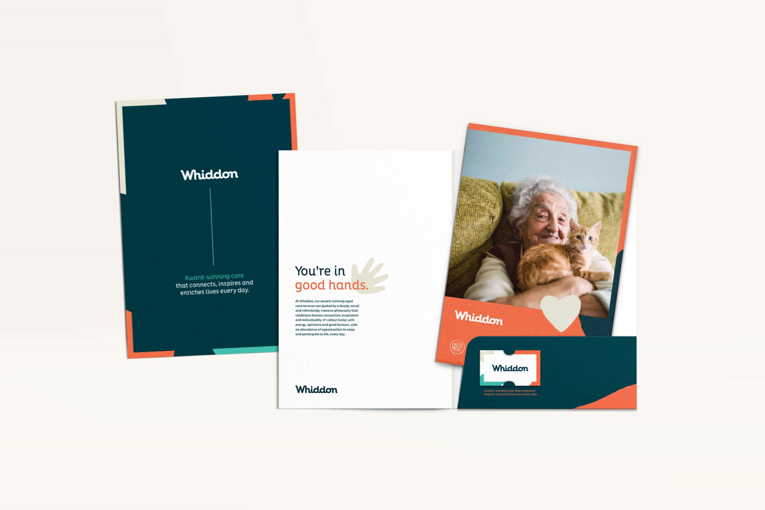
A Flexible Brand System
A Flexible Brand System
For Whiddon to communicate effectively with each of their audiences, a brand system that allowed them to tailor the visual tone of their message was needed. Comprehensive brand guidelines were developed to demonstrate how best to express themselves – from layouts that appear calm and restrained, to more open and playful.
For Whiddon to communicate effectively with each of their audiences, a brand system that allowed them to tailor the visual tone of their message was needed. Comprehensive brand guidelines were developed to demonstrate how best to express themselves – from layouts that appear calm and restrained, to more open and playful.
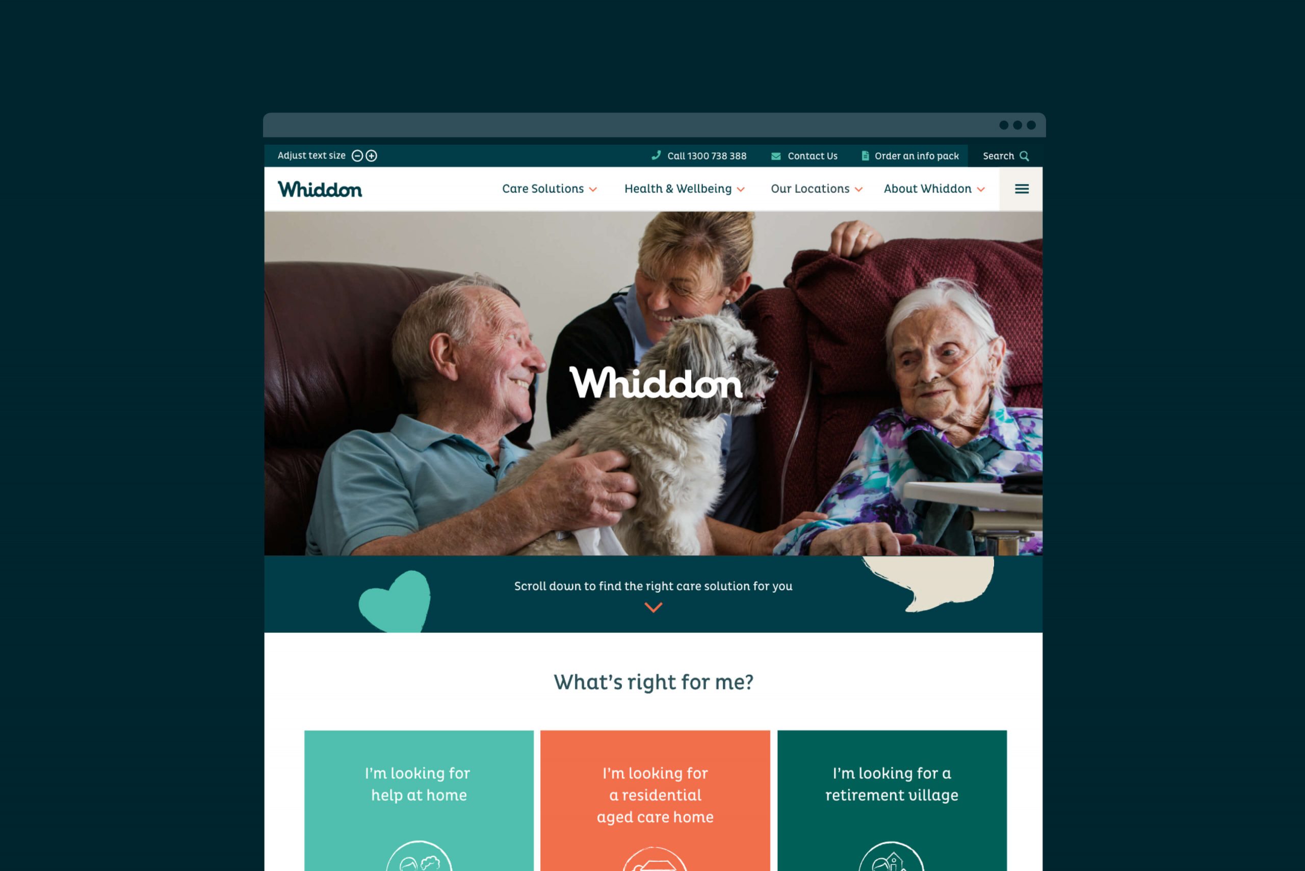
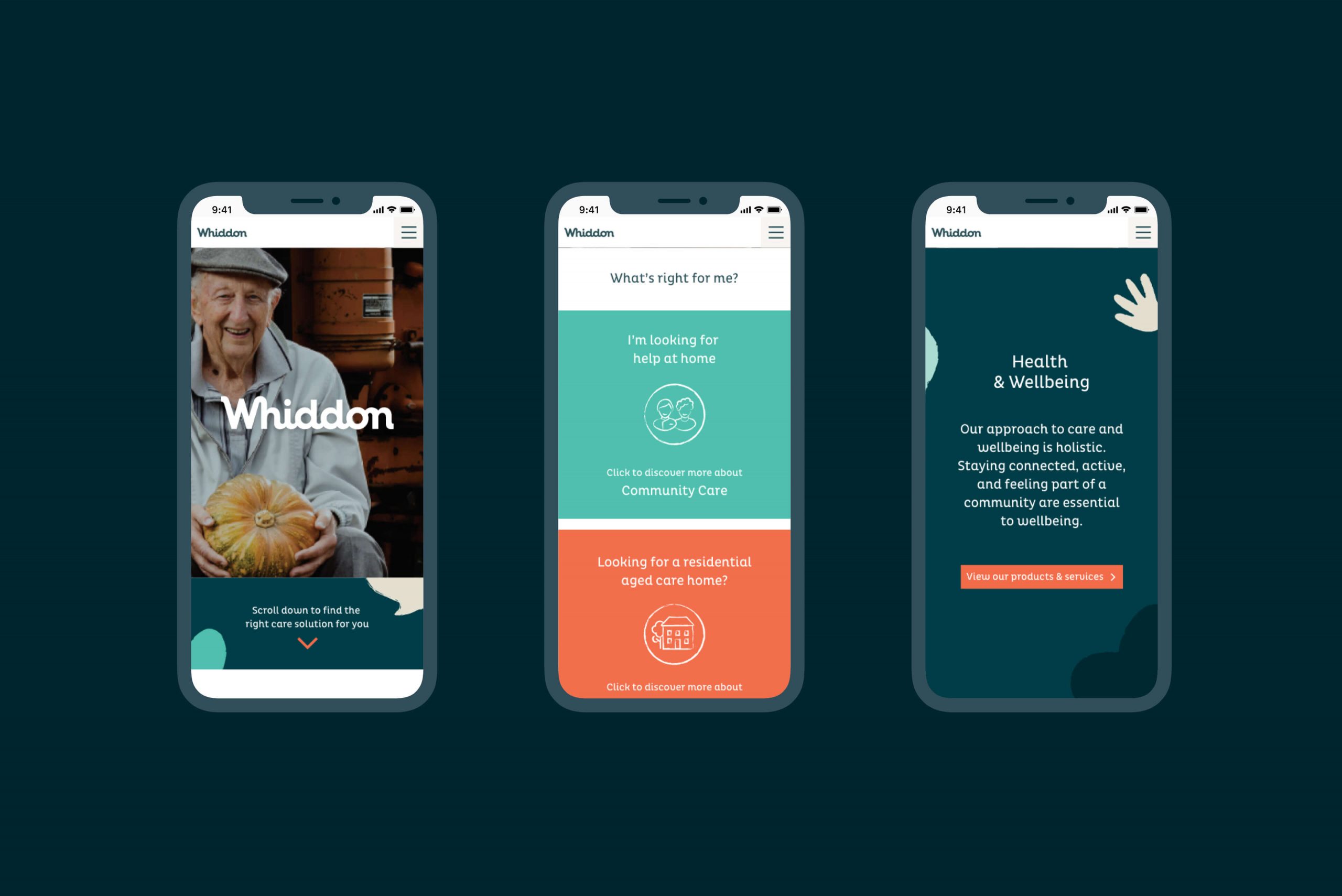
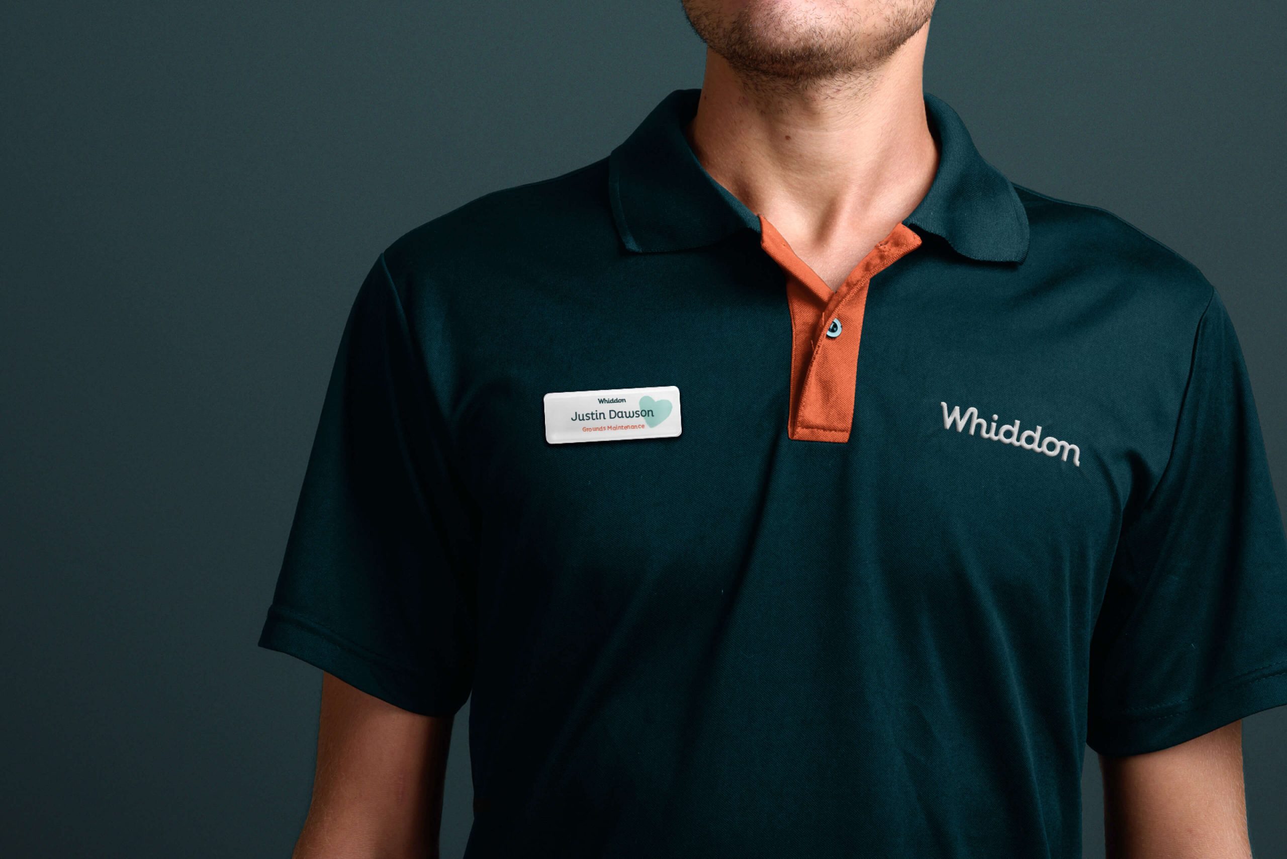
From Uniforms To Livery
From Uniforms To Livery
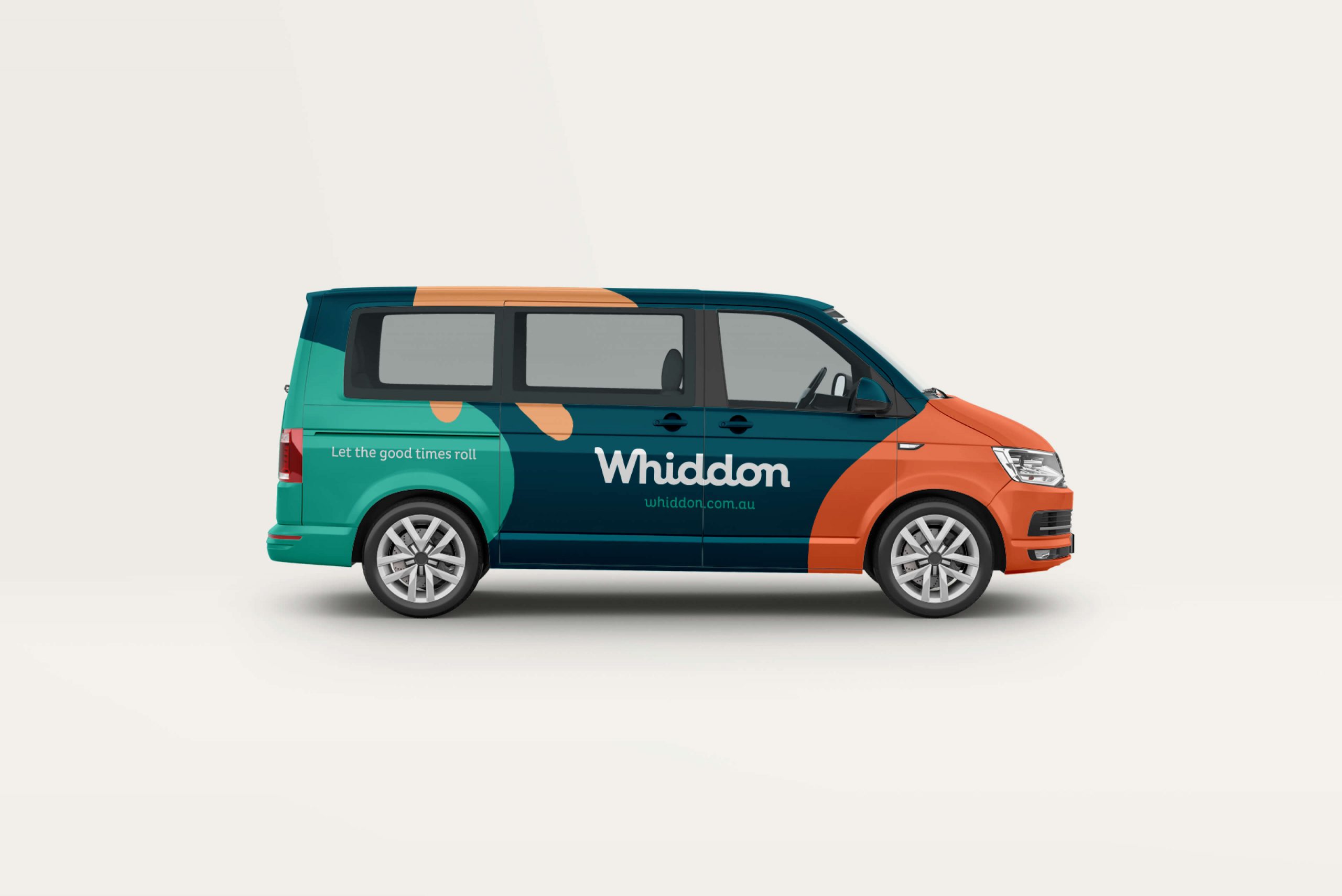
An extensive refresh allowed us to explore Whiddon’s total brand experience. Everything from uniforms to digital assets, to signage guidelines, was designed to align to the new identity. We even created the livery for Whiddon’s very own shuttle service. A truly complete and uniquely human brand identity that captures its peoples warm and caring character.
An extensive refresh allowed us to explore Whiddon’s total brand experience. Everything from uniforms to digital assets, to signage guidelines, was designed to align to the new identity. We even created the livery for Whiddon’s very own shuttle service. A truly complete and uniquely human brand identity that captures its peoples warm and caring character.
"After shortlisting a number of potential partners, we choose There as our brand agency. They demystified the journey we could expect, and really took the time to listen and understand our needs. Working with the brand team has been a rewarding and collaborative experience from start to finish. Their professionalism and creativity made the entire process refreshing and easy. We look forward to continuing our relationship in the future."
"After shortlisting a number of potential partners, we choose There as our brand agency. They demystified the journey we could expect, and really took the time to listen and understand our needs. Working with the brand team has been a rewarding and collaborative experience from start to finish. Their professionalism and creativity made the entire process refreshing and easy. We look forward to continuing our relationship in the future."
Chris Mamarelis
CEO - Whiddon
Chris Mamarelis
CEO - Whiddon
"The team at There has created a truly unique brand that is instinctively Whiddon at its heart. The team took the time and care to really understand why we exist and created a brand that fundamentally reflects who we are.
Delivering a flexible and fresh identity that is both vibrant and personable. The result is a differentiated brand that all of us can be genuinely proud of. We would not hesitate to recommend them to others."
Amiria MacKinnon
General Manager Marketing & Communications - Whiddon
Amiria MacKinnon
General Manager Marketing & Communications - Whiddon
Project Completed at:
There Studio
Project Team:
Paul Tabouré
Matt Player
Caroline Leung
Ebony Goh
Manusr Amiri
Tania Sacco
Currently
Freelance Independent Branding Consultant
Location
Sydney,
Australia
Connect
LinkedIn
Instagram
Connect
LinkedIn
Instagram
Contact
hello@deanhazelgrove.com
+61 498 187 010
Contact
hello@deanhazelgrove.com
+61 498 187 010
© 2020